UBA Mobile, concept redesign
Breathing new life into a legacy banking app
One of Africa's biggest banks, and a mobile app that wasn't keeping up. A user-led redesign making the experience more intuitive, modern, and trustworthy.
Problem
A major bank's app felt dated and stressful, with red everywhere and everyday tasks buried.
Solution
A user-led redesign of onboarding, sign-in, home, transfers and payments, saving red for the moments that need it.
Result
Interactive prototypes in light and dark mode showing calmer, faster everyday banking.
The problem
UBA is one of Africa's biggest banks, but its mobile app falls short of modern user expectations. As a long-time customer, I found the outdated design and frustrating experience disappointing, something many users echoed. The dominance of red throughout, while brand-consistent, evoked the wrong emotions: stress, error, danger.
Home
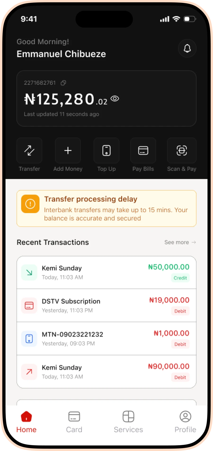
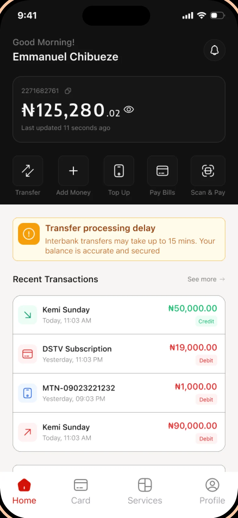
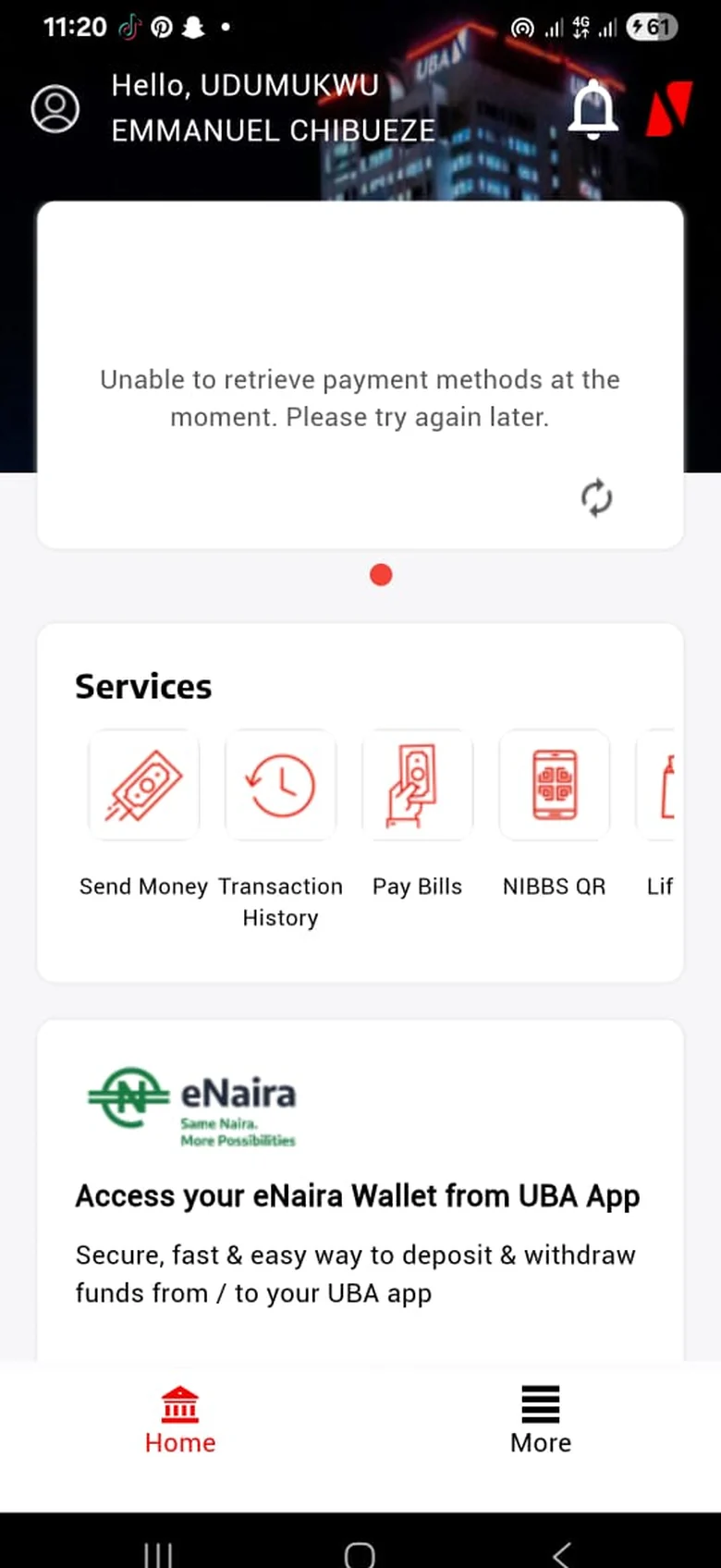
The old home opened on an error card and hid everyday actions in a sideways scroll. The redesign puts the balance, five quick actions and recent activity on one screen, and keeps red for debits and alerts.
Transfers
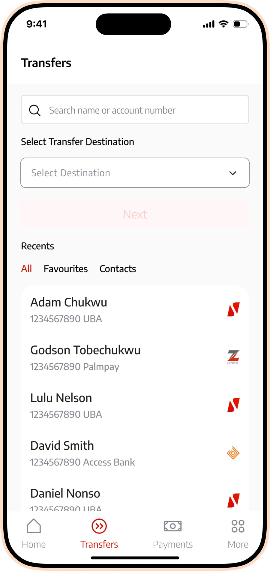
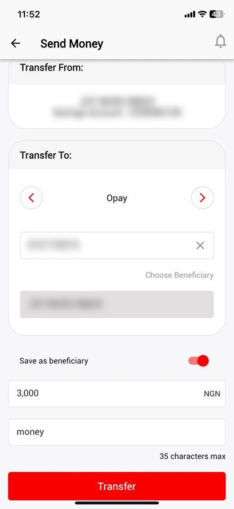
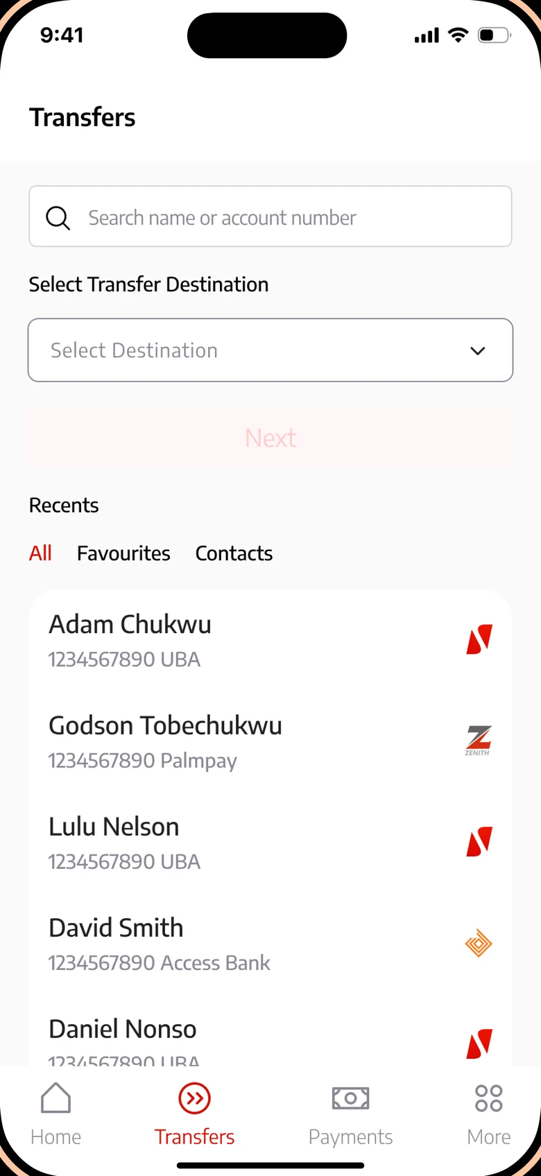
Sending money used to start with a bank carousel and stacked forms. The new flow starts with search and recent recipients, grouped into all, favourites and contacts, so repeat transfers take fewer taps.
Bills and payments
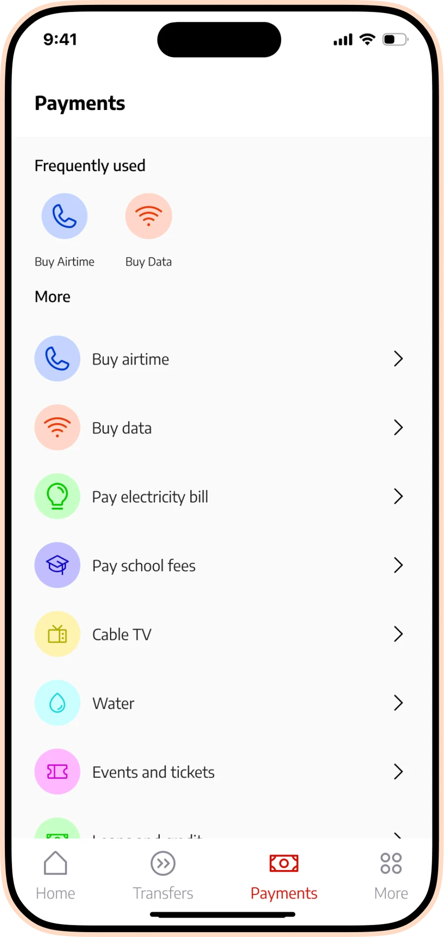
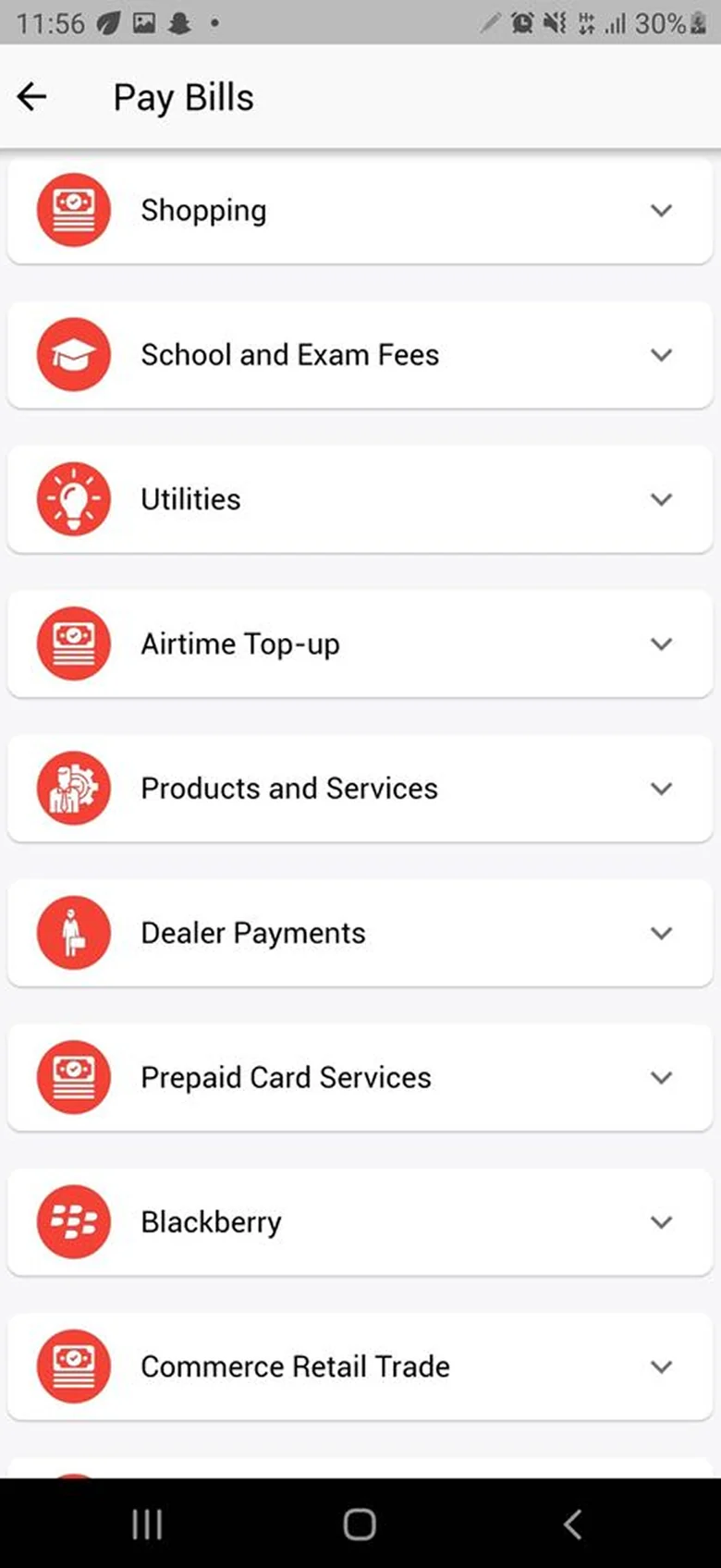
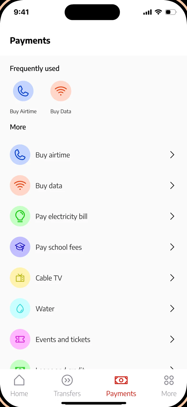
Pay Bills was a long list of vague categories, many sharing the same icon. Payments now pins the most frequent actions at the top and names everything else by what people actually pay for, with automatic network detection for airtime and data.
Onboarding and sign-in
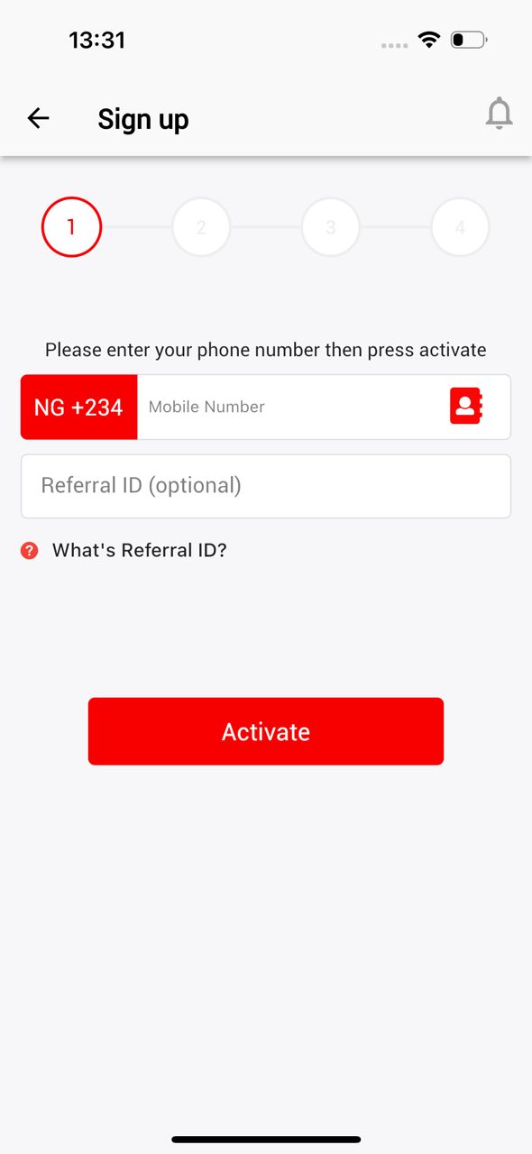
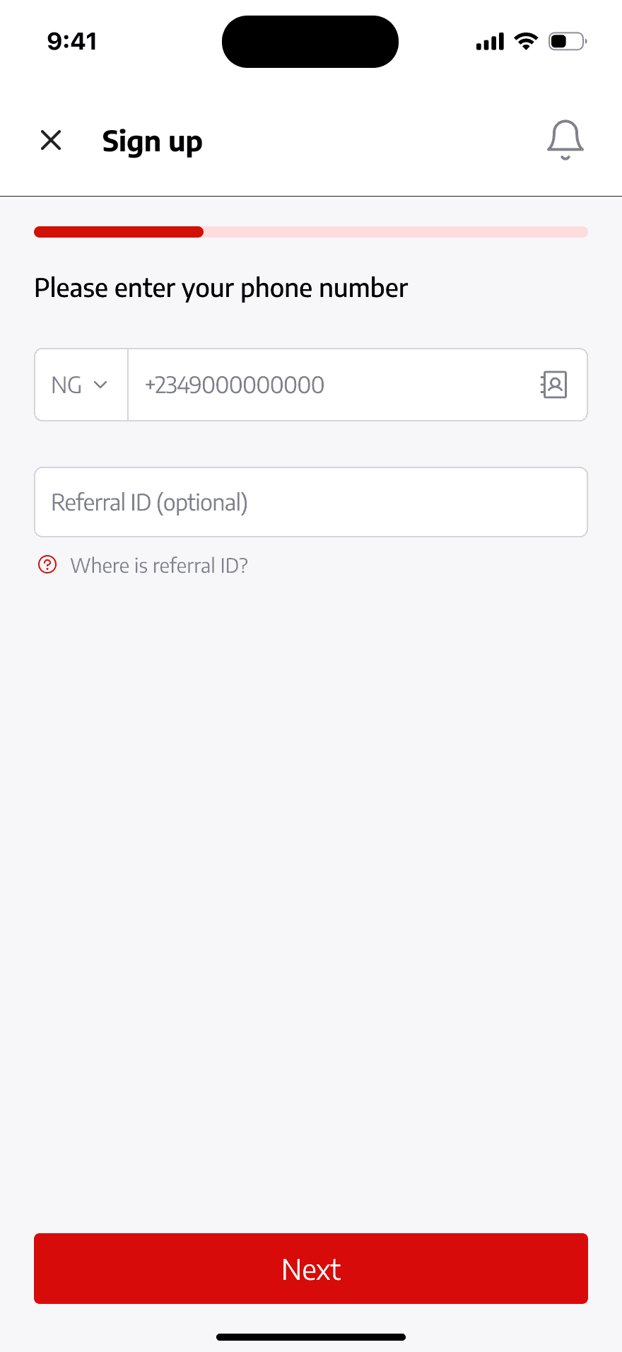
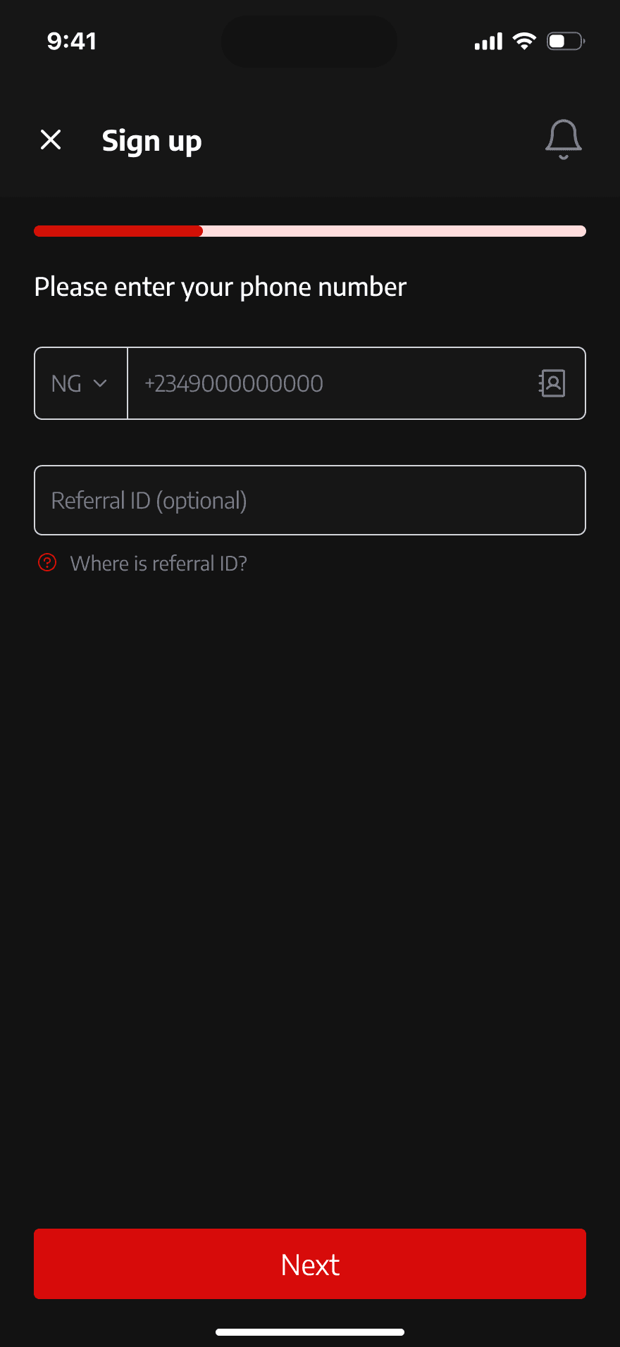
I reimagined the sign-in pagination and tackled red's dominance on input fields, aligning onboarding with modern standards.
Conclusion
This redesign is more than a visual upgrade. It's a user-centred transformation. Every change was made with the user in mind, from removing outdated features to introducing modern, industry-aligned solutions.