Thirty's 3, e-commerce
Skincare that feels personal
A skincare shopping experience as glow-worthy as the products it sells. Clean, thoughtful design from landing page to product detail.
Problem
A skincare brand needed an online store that felt as premium and personal as its products.
Solution
End-to-end design, from research to Figma to a live Framer build, landing page to product detail.
Result
A live store with a warm palette that still passes WCAG contrast.
Overview
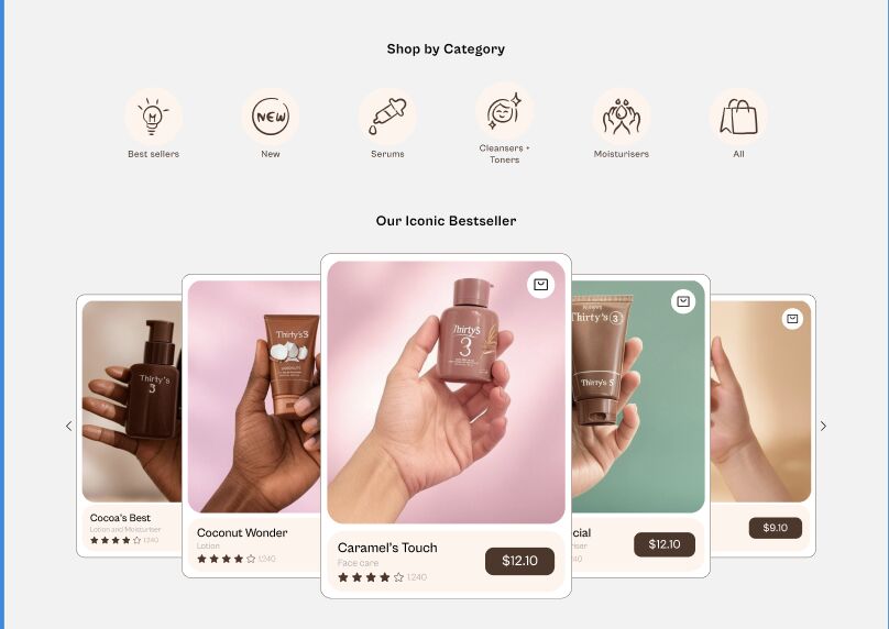
Thirty's 3 is a skincare shopping experience designed to feel as premium as the products it sells. Clean, thoughtful e-commerce design, from a landing page that draws you in to a product details page that gives shoppers everything they need to buy with confidence.
Landing, products and product detail
Accessibility challenge
A light peach element (#FFF4EC) was blending into the grey background (#F2F2F2), failing WCAG contrast requirements. I swapped in the brand's rich brown (#4E3629), boosting contrast while keeping the warm brand feel intact.
Role and skills
End-to-end ownership, from UX research and Figma UI design to building the live experience in Framer.