Akinia, B2B SaaS
Reimagining an investment intelligence platform
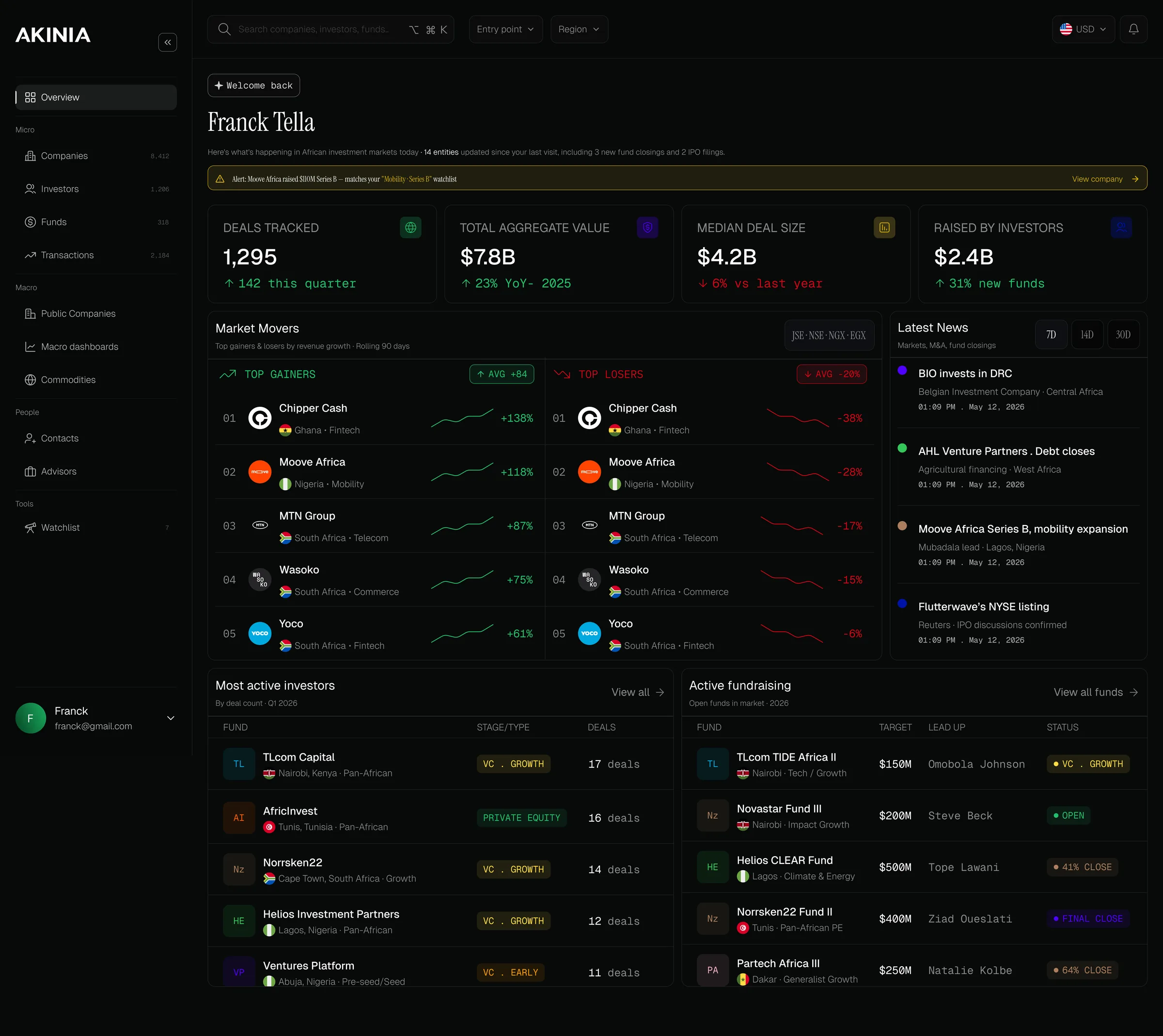
A complete product redesign for a private markets intelligence platform tracking investment opportunities across Africa, from dense, inconsistent screens to a coherent, institutional-grade experience.
Problem
Valuable data was buried under a dense hierarchy, inconsistent patterns and heavy cognitive load.
Solution
A platform-wide redesign guided by four principles, with a reusable component system underneath every screen.
Result
A complete, production-ready redesign in light and dark mode, documented for development.
8,412
Companies tracked on the platform
54
African countries covered
19
Commodities in one workspace
2
Themes, light and dark
Overview
Akinia is an investment intelligence platform designed to help investors discover, evaluate, and monitor private market opportunities across Africa. The objective of this engagement was not to redesign a single page. It was to rethink the product experience across the entire platform, while creating a scalable design system that could support future growth and accelerate development.
The redesign covered the complete web application: dashboards, company intelligence, transactions, funds, authentication, profile management, and a reusable design system for implementation.
The challenge
The existing platform contained valuable information, but the experience made it difficult for users to efficiently consume and navigate large amounts of financial data.
Dense information hierarchy
Users couldn't quickly find what mattered.
Inconsistent visual patterns
Cognitive overhead on every screen.
Limited component scalability
New screens required rebuilding from scratch.
Outdated visual language
It felt misaligned with the platform's ambition.
Heavy cognitive load
Data-heavy screens felt overwhelming.
My approach
Rather than redesigning screens independently, I approached the project as a product system. Every design decision was guided by four principles.
Information first
Prioritise clarity over decoration. Every element earns its place.
Build once, reuse everywhere
Create reusable components instead of solving the same problem repeatedly.
Reduce cognitive load
Simplify interactions without removing analytical power.
Design for development
Ensure every component could be implemented using design tokens and reusable patterns.
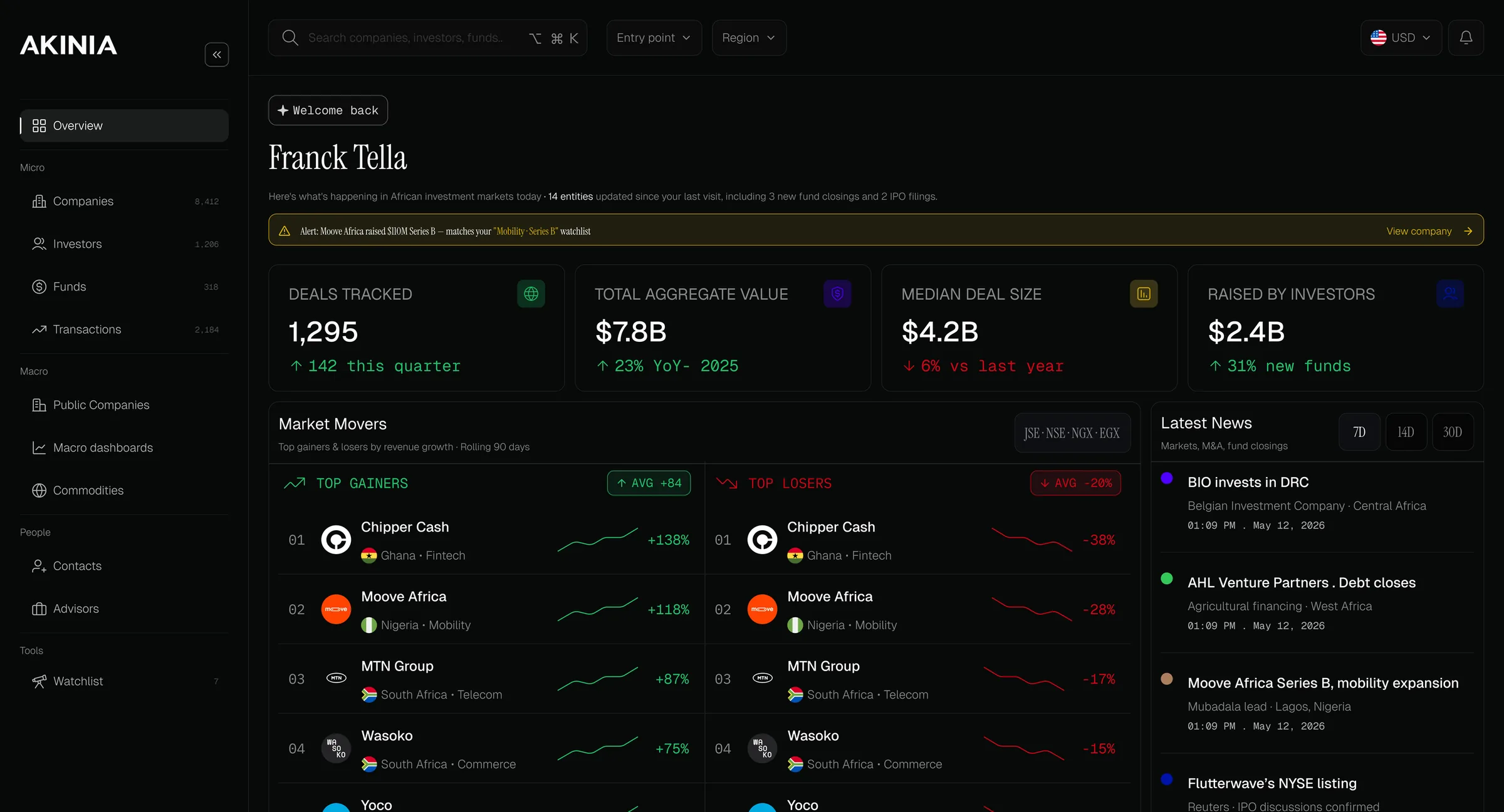
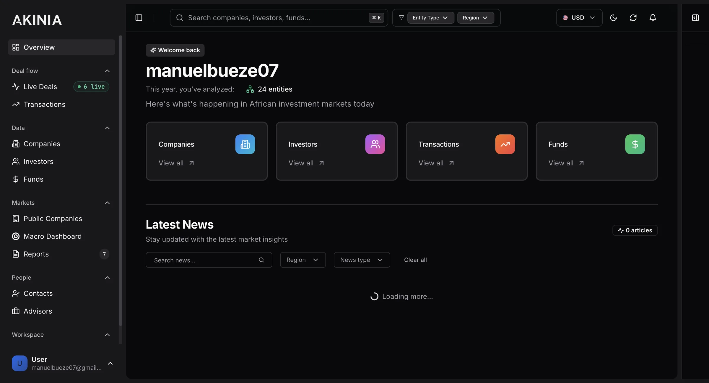
Overview dashboard
The dashboard was redesigned to surface the most important insights first, reducing visual clutter while improving scanability: better information hierarchy, a simpler card system, more readable charts, stronger visual grouping, and clearer KPI presentation.
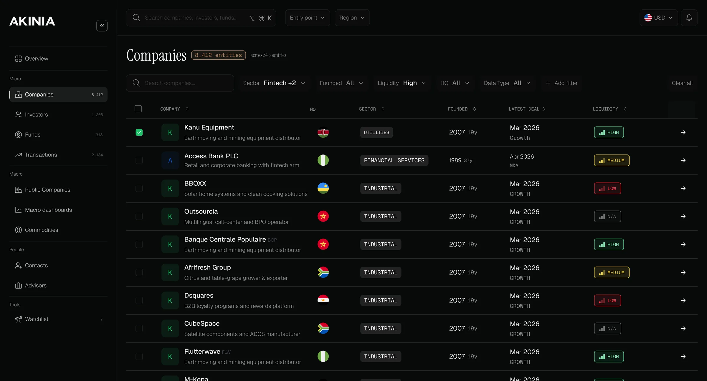
Companies
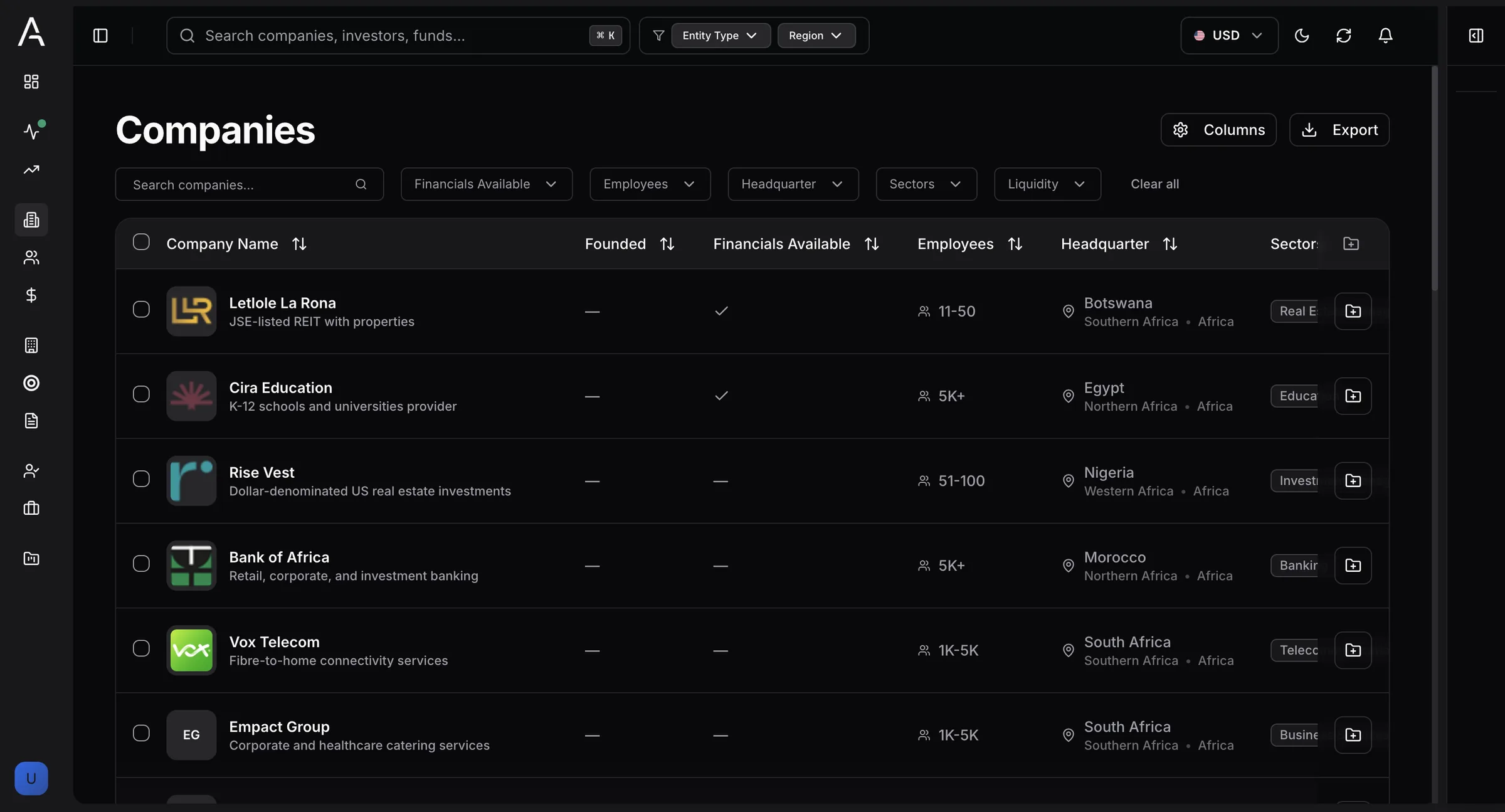
The Companies page was redesigned around efficient exploration of investment opportunities: a redesigned filtering experience, better table hierarchy, a consistent badge system, improved search, and better readability for dense datasets.
Company details
The company profile became the central intelligence hub, consolidating company information into a structured experience that is easier to navigate, with clear content hierarchy, better section organisation, and improved financial information presentation.
Commodities
Beyond private companies and investment activity, investors also monitor the commodities that influence African economies. I designed a dedicated Commodities workspace that brings together futures pricing, settlement data, trading activity, and market performance into a single, highly scannable interface.
The experience organises commodities into intuitive categories (metals, agriculture, energy, and industrial materials), letting users move between sectors while preserving context. Rather than relying on charts for every comparison, the interface prioritises structured tabular data with careful spacing and typography.
The result is a workspace that feels familiar to professionals used to Bloomberg Terminal-style products, while remaining significantly cleaner, more approachable, and visually modern.
The system underneath
Instead of creating isolated screens, I built a design system underneath the redesign so every page stayed consistent. It served as the primary reference for development.
- Colour tokens
- Typography scale
- 8-pt spacing
- Button variants
- Form controls
- Table patterns
- Status badges
- Empty states
- Light and dark themes
Collaboration
This project was highly collaborative. Throughout the engagement I worked closely with both the founders and the developer, iterating on screens, refining component behaviour, and keeping the design system consistent. The goal was not simply to deliver mockups, but to provide a scalable foundation that could be built efficiently.
“You've been very professional throughout, and we really appreciated the quality of your work and your involvement. You did a very good job, and we're genuinely grateful for your contribution to the project.”
Outcome
Although the project was paused before implementation due to the client's internal priorities, the redesign delivered a complete, production-ready body of work.
- Complete product redesign
- Production-ready design system
- Developer documentation
- Light and dark mode
- Reusable component library
- High-fidelity prototypes
Reflection
One of the biggest lessons from this project was learning how to balance visual polish with long-term scalability. Working closely with both stakeholders and developers reinforced the importance of building reusable systems, documenting design decisions, and keeping consistency across a complex, data-heavy product. The work remains one of my most comprehensive product design engagements.